Getting feedback, whether through user interviews, surveys, or some other means is an integral part of developing good products. But how do you make sense of the jumble of comments, quotations, and insights?
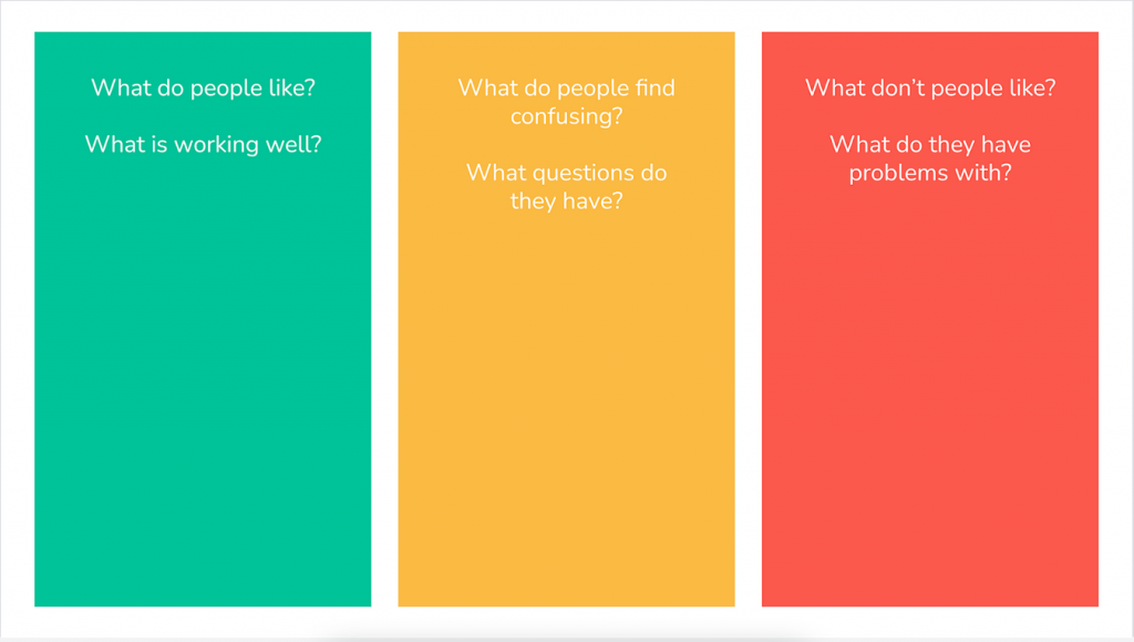
This Traffic light categorisation Whimsical template is a super-simple way of dividing the feedback you get into three areas:
- Green — what do people like? what’s working well?
- Yellow — what do people find confusing? what questions do they have?
- Red — what don’t people like? what do they have problems with?
Target group: project team, single employees, workshop group
Time: 45 minutes
Material: Whimsical template
Goals: clustering feedback for a service or product to get a better overview

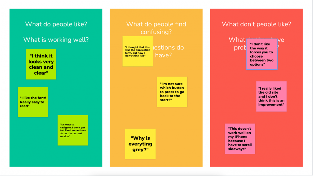
Add sticky notes to add verbatim quotes from people who have given feedback on your idea, product, or whatever it is that you’ve put in front of them. Bonus points for colour-coding the stickies with the background!

The value of taking this approach, simple though it might be, is that it immediately allows you to zero-in on the things that can perhaps be ignored (e.g. “I really like the old site…”) and focus on tweaks which might make things better (e.g. “I’m not sure which button to press to go back to the start?”
Click here to make a copy of the Traffic light categorisation template

